
Color Combination: Learn How to Mix Colors!
Feb 11, 2021
Why are colors so important in our life? Why is it crucial to create a perfect color scheme for our space? It’s because color is a form of non verbal communication that can radically affect our mood and emotions. When you walk into any space, the way your eye translates color and color combinations can affect how you interpret the style, mood, and overall comfort level of the space.

We are constantly combining colors. When selecting our outfit or when we’re buying a cushion to match in our living room, all the time, for every single detail, we are mixing and matching colors. However, a color theory exists to make the process on how to combine colors easier. It’s a primary design lesson and it serves a lot for your daily life as well.

Here, we’ll learn how to combine colors and how to use the color wheel to create the perfect color scheme, along with some tips an ideas on how to incorporate color combinations into your space.
COLOR THEORY 101
Color theory is the science about how we interpret the colors we see in the world, and how we respond to specific color combinations and proportions. Color theory starts with the color wheel.

Red, blue, and yellow are the building blocks of all other colors on the wheel. They cannot be made from mixing other colors. Secondary colors are the ones that can be created by mixing two primary colors. These colors are orange, green, and purple. Lastly, Tertiary Colors the six shades that can be made from mixing primary and secondary colors.
Now let see the ways to use the color wheel for selecting a color scheme:
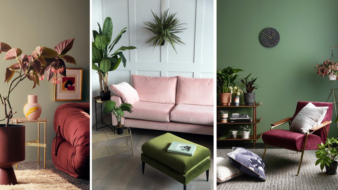
Analogous Color Scheme
You can create an Analogous color scheme, which uses three or more colors that sit next to one another on the color wheel. For example, red, orange and yellow or red, purple and blue.


Since you’re using three colors in this one, proportion is important to make sure the space feels balanced. You may want to incorporate the 60-30-10 rule to keep a good proportion between colors.

Maybe you are the kind of person that prefers to have a neutral color palette for the overall look of the space, but you want to add a pop of color into the room. If that’s the case, you can apply the same analogue color scheme into you accent elements and accessories as well.

Complementary Colors
Another way to use the color wheel is by selecting complementary colors. When it comes to color schemes, complimentary is the simplest. That’s because this color scheme only involves two shades. It uses two colors that sit opposite each other on the color wheel. For example: yellow and purple, green and red or blue and orange.

Typically one color acts as the dominant shade and the other as an accent. These color pairings are extremely high contrast, so you need to be careful on how to use it because they bring a strong energy into the space, so it’s a good idea to be used in small doses.

For example, you can paint an accent wall in blue and pair it with some yellow details like cushions, vase or wall art. You should think of them as your accent colors and use plenty of neutrals to balance them out and provide a place for the eye to rest.

Also, like the analogue color example, you can add a pop of color into a neutral general space applying two contrasting colors into you accent elements and accessories as well.
Monochromatic Scheme
A Monochromatic color scheme uses tints, tones and shades within the same hue or color family. But, what are tints, tones and shades? Adding white to a pure color creates tints. Tints are often associated with pastel colors because they are softer and subtle. Adding black and white (gray) to a pure color, creates tones of a color. Adding black to a color creates shades.


Monochromatic color schemes are derived from a single base hue and extended using its shades, tones and tints. Unity is one of the benefits of using a monochromatic color scheme, but on the other hand, this color scheme has the risk of making the room feel boring, so the most attractive way to complete your color scheme is with texture and print to add movement into the space. It’s also important to add some natural texture or metals to add dimension to the space.

However, since interior design is not rigid, you can mix and match different colors schemes. For example: you can have your walls, furniture, flooring and the general elements of the space in black, grey and white (which is a monochromatic option) and combine it with a contrasting color scheme for you accessories, like pairing a blue ottoman with orange cushions, vases or other kinds of accessories.

Some important extra tips at the time of adding colors into the space are:
- Tie Rooms Together With Accents. Accent colors can change from room to room, but continuing one consistent color throughout the home can help create a sense of continuity. Its purpose is to move the eyes around the different rooms and to associate each one to another using the same color in some details, helping you balance and unify the space.
- Another simple way to create a cohesive feel is to use a consistent paint color on the walls, especially in homes that have and open space concept.
- Add colored prints to add textures and shapes into the space and pair it with solid colors following the color schemes rules to get a perfect combination.
Also, you can find a guide with more detailed information on how to combine colors HERE!

